Source code is the digital product of bazillions of decisions made by any number of people. There aren’t a lot of clear cut answers in the world of software development so many of these decisions end up getting made on the basis of past experiences, future projections, and…hangry-ness.
I’m a software craftsmanship enthusiast. I try to follow best practices and I try to strike the balance between principles and pragmatism. I try to make good decisions, but it’s difficult to keep perspective as the size of the projects and sheer number of decisions grow.
How do you track your progress?
How are you doing, really?
Enter NDepend
NDepend is a static analysis tool for .NET that gives you informative and ACTIONABLE information on code. It’s immensely helpful for diagnosing problems and getting an unbiased look at your work because, as you know, what get’s measured gets done.
In this article, I’m going to take a look at three aspects of NDepend through the lense of some popular and personal open-source projects, with emphasis on…
- Fact Based Metrics
- Visualizations
- Progress Tracking Over Time
Click to download the full reports here.
The worst code I ever saw, was the code I wrote 6 months ago – Every coder ever
Fact Based Metrics
I think the biggest value of static analysis tools comes from tracking your project’s improvement over time…but it’s still fun to look at the snapshots! You can get basic line, comment and file counts from tools like cloc but NDepend goes the extra 80+ mile and includes metrics on a TON of other things as well, including 3rd parties.
Knowing how big your project is can either give you a sense of accomplishment or horrible dread, but either way seeing that your last refactor reduced your codebase by X% still feels mighty nice.
Below is a chart of a few open-source projects with data that I pulled from NDepend. I was really surprised by how many 3p assemblies SignalR references, though the ratio of methods called is actually less than that of Entity…interesting!
| Project | Lines | Types | Files | 3P Assemblies | 3P Methods |
| Entity Framework | 92086 | 7766 | 1297 | 30 | 4599 |
| JSON.net | 31704 | 1468 | 523 | 19 | 1462 |
| ColorMine | 889 | 95 | 40 | 3 | 55 |
| SolidTacToe | 357 | 65 | 51 | 4 | 63 |
| SignalR | 18155 | 1955 | 574 | 42 | 563 |
NDepend has a TON of rules, and you can see the linq expressions to see exactly what’s going on. For example, here’s the code for finding long methods: http://www.ndepend.com/defaultrules/Q_Methods_too_big.html
Below is a chart that shows the rule validations for each project. I’m surprised to see the 15 red (critical) issues within Entity Framework. My trivial SolidTacToe implementation had 2 even though it’s .3% the size. Yikes! I’m willing to bet that the Entity team is running a static analysis tool as part of their build process.
| Project | Red | Orange | Green | Method Complexity | Method Complexity (Avg) |
| Entity Framework | 15 | 76 | 15 | 23 | 1.15 |
| JSON.net | 11 | 62 | 66 | 90 | 2.03 |
| ColorMine | 3 | 35 | 101 | 9 | 1.57 |
| SolidTacToe | 2 | 20 | 117 | 6 | 1.54 |
| SignalR | 9 | 72 | 58 | 26 | 1.57 |
What gets measured gets done.
Visualizations
NDepend includes a number of different visualizations that give you a few really good views of your code. My favorite views are the Treemap Metric View and the Abstractness vs Instability graphs.
Visual TreeMap
Is your code a monolithic ogre beast or an interface laden broken glass menagerie of minute functionalities?
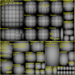
I like the treemap view because it organizes your code by size. The default view shows assembly and namespace, the bigger the square the more lines of code. If you’re using the dashboard inside of Visual Studio you can drill into these sections and the graph will show you the same kind of information for classes and methods as assemblies and namespaces. Awesome, right?
In the following graph of ColorMine, you can see that the tests for the Rgb colorspace are much larger than the other namespaces in that assembly, but the tests for the other color spaces (XYZ, CMYK, LUV, etc) are about the same size. You can also see that there are more tests for color conversions than there are for comparisons, even though the comparisons make up for almost half of the code. Awesome, right?
Instability vs Abstractness
Are you in the zone of pain, or the zone of uselessness?
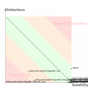
My second favorite visualization graphs attempts to determine and show how well you’re sticking to the principles of good design, like high cohesion and low coupling. I try to keep things like SOLID and Law of Demeter in mind when I code, but I was surprised to see that some of my code (as well as most of the projects I looked at) still ranked closer to the “Instability” side, so I’m a bit skeptical of this graph, however it is a great reference for refactoring.
The graph below of SignalR gets a little messy, but it’s interesting to see that the tests (especailly the js tests) fall into the zone of pain…which is right where I expect them to be:
Progress Over Time
For me, the most value from this product comes from its use over time. Software projects are like apples and oranges, it doesn’t make sense to compare them to each other. The hairiness of your project often reflects the hairiness of the problems you’re trying to solve and sometimes there are good reasons for doing bad things.
That said, you can compare a project’s metrics to itself.
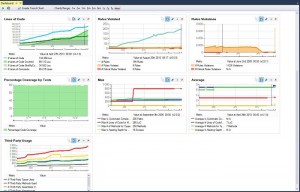
This is my favorite feature of NDepend. You can automate reports as part of your build process, and the reports use the data from prior runs to give you trend lines on the metrics of your choosing. You can even compare snapshots to see what’s changed between different points in the code’s history. Friggin’ Sweet!
Seeing the trend lines let’s you know when things start going downhill, when the cost-to-fix is lowest. And don’t forget about the Broken Windows Theory!
The broken windows theory is a criminological theory of the norm-setting and signalling effect of urban disorder and vandalism on additional crime and anti-social behavior. The theory states that maintaining and monitoring urban environments in a well-ordered condition may stop further vandalism and escalation into more serious crime. – Wikipedia
Conclusion
If you care about your craft, then you should check out NDepend’s free 14 day trial and see how you like it. It gives you great metrics, visualizations and progress tracking so…why not?
Check out Coding Blocks Episode 15 to hear more about NDepend and static analysis.


